

Market Data & Analytics
VTrade provides comprehensive market data coverage and professional-grade analytics tools designed to support every stage of the investment decision process — from initial screening and idea generation, through deep fundamental research, to ongoing portfolio risk management and optimization.Market Overview
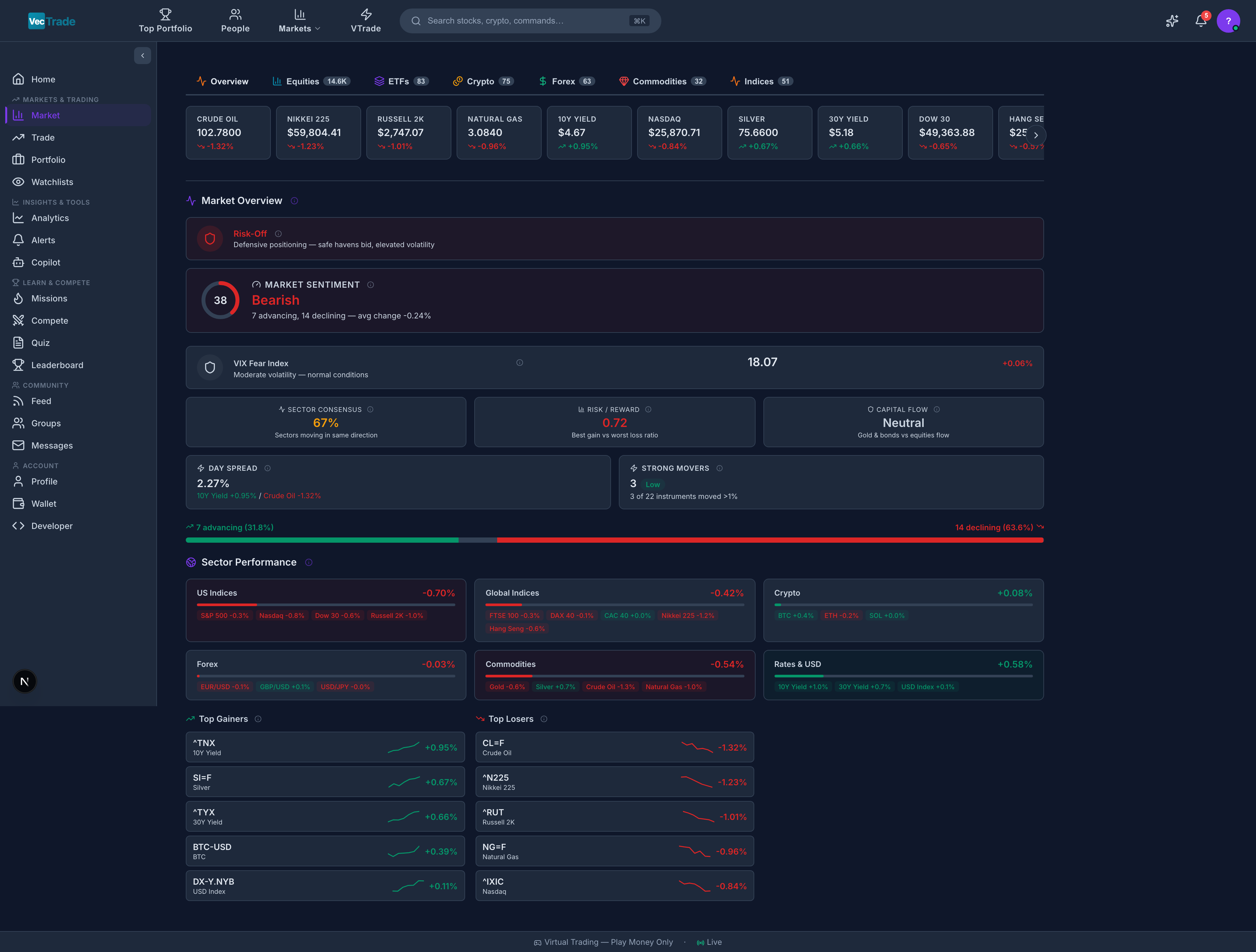
Global Ticker Strip
A persistent horizontal ribbon at the top of the Market page displays 24 benchmark instruments updating in real-time:
Each ticker shows: symbol, current price, and change % with color coding (green = positive, red = negative).
Overview Dashboard
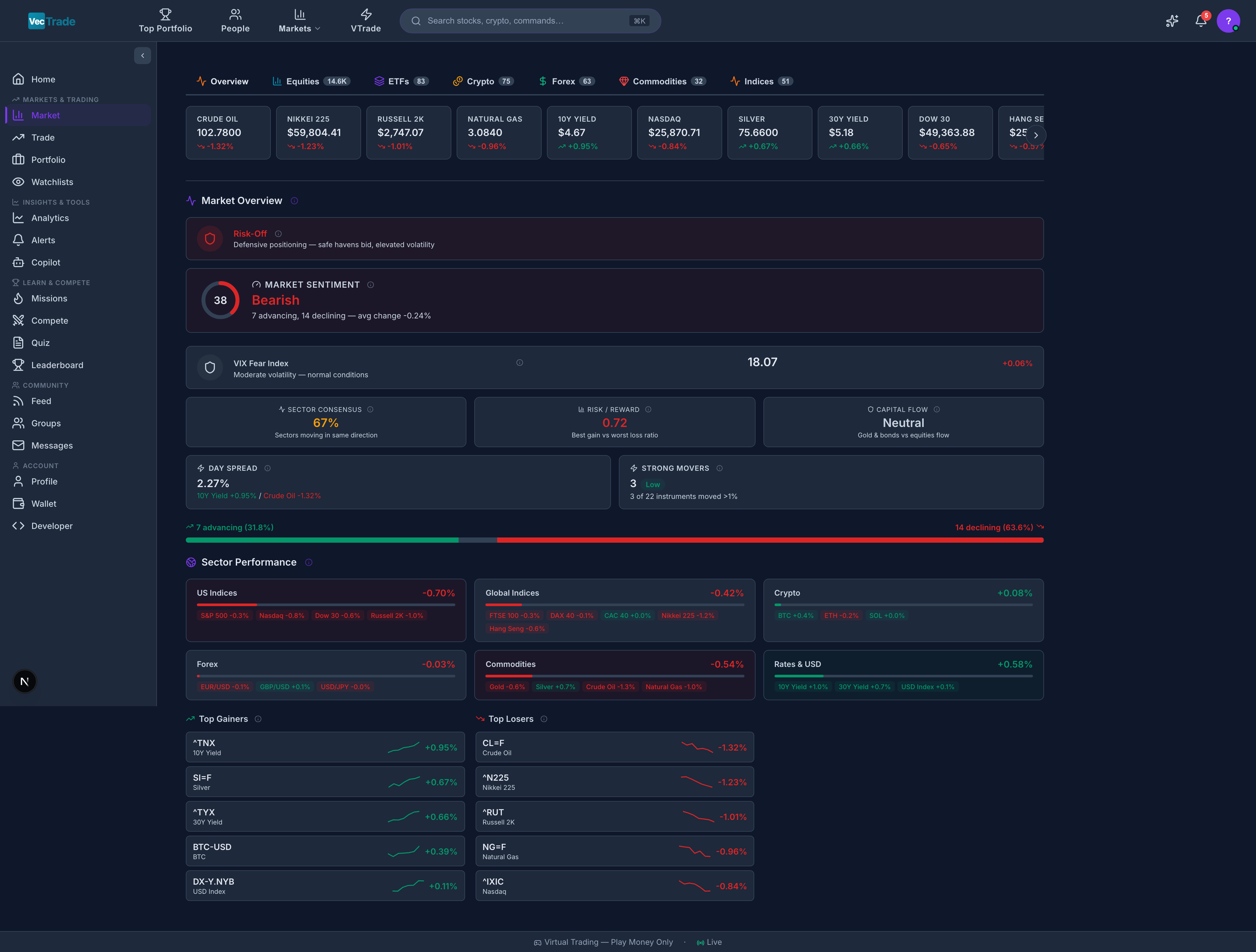
The default Market tab provides a consolidated view of current conditions: Market Breadth Indicator:- Displays the ratio of advancing vs. declining securities across major US exchanges
- Visual bar chart showing the advance/decline line
- Breadth above 2:1 suggests strong bullish momentum; below 1:2 suggests broad selling pressure
- A semicircular dial indicating aggregate market sentiment
- Scale ranges from Extreme Fear → Fear → Neutral → Greed → Extreme Greed
- Derived from multiple inputs: put/call ratio, VIX level, market breadth, new highs vs. new lows, and social media sentiment analysis
Sector Heatmap:
- Color-coded tile grid with each tile representing a GICS sector
- Tile size proportional to sector’s total market capitalization
- Color intensity indicates magnitude of daily performance
- Green = positive sector return; Red = negative sector return
- Hover for precise percentage and dollar contribution to the market
- Current VIX level with historical context
- Classification labels: Low (< 15), Moderate (15–20), Elevated (20–30), High (30–40), Extreme (> 40)
- 30-day VIX chart showing volatility trend
Asset Class Tabs
The Market page features dedicated tabs for each tradable asset class. Each tab presents a comprehensive sortable table with asset-class-specific columns.Equities
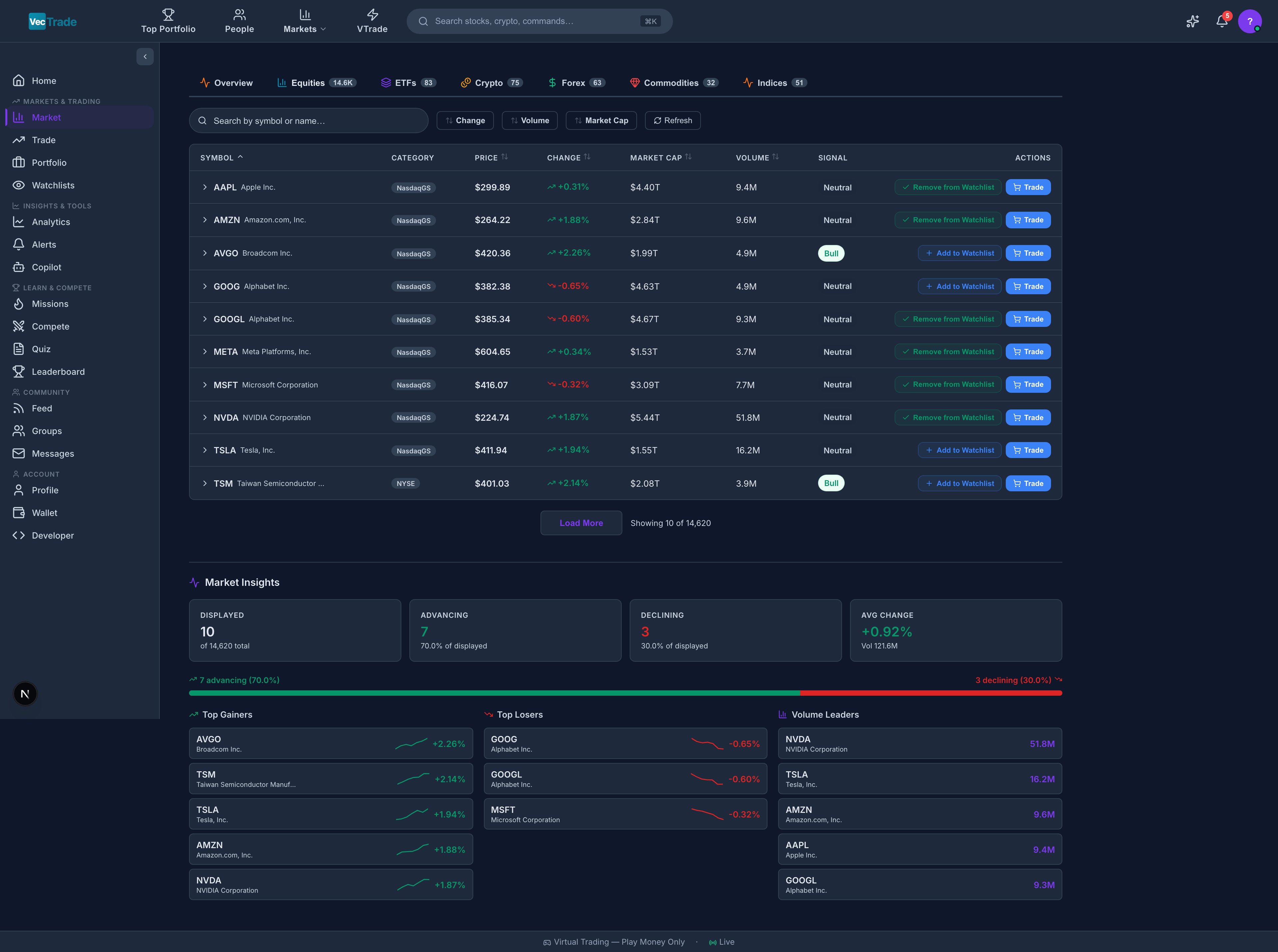
Table Columns: Symbol, Name, Exchange, Price, Change %, Volume, Market Cap, P/E, 52W Range, Sector.
ETFs
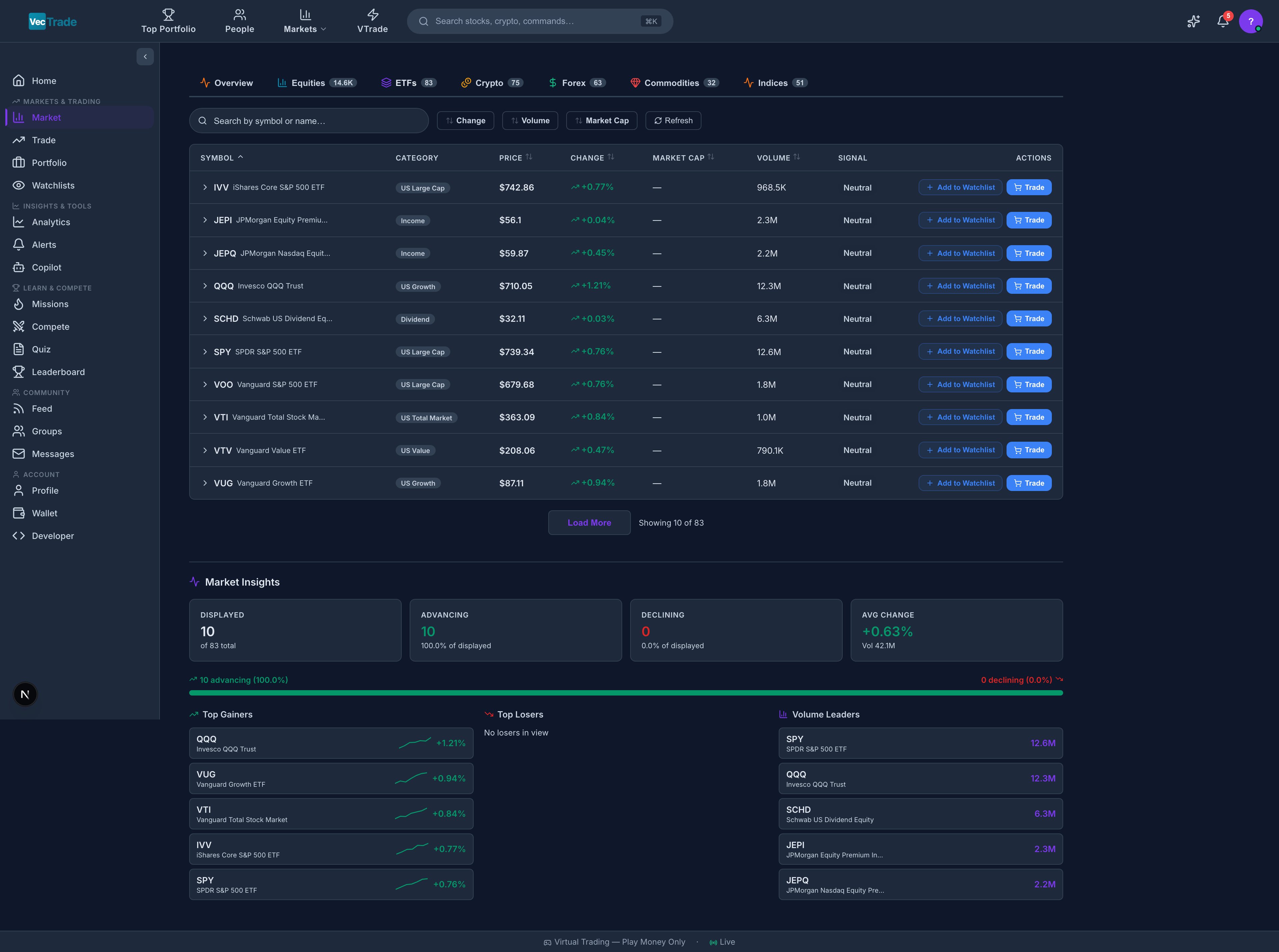
Table Columns: Symbol, Name, Category, Price, Change %, AUM (Assets Under Management), Expense Ratio, Yield, Volume.
Cryptocurrencies
Trading Hours: 24/7/365 — crypto markets never close.
Table Columns: Symbol, Name, Category, Price, Change % (24h), Market Cap, Volume (24h), Circulating Supply, All-Time High.
Forex
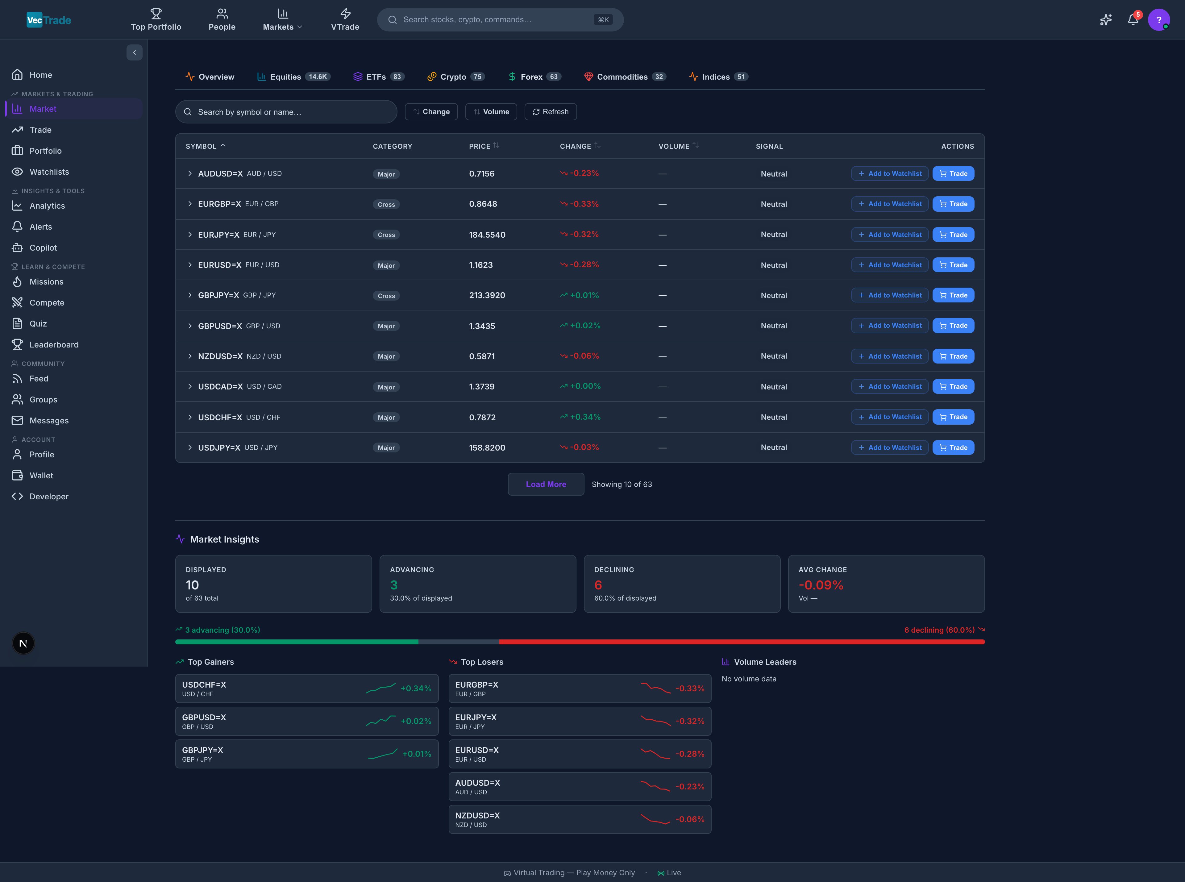
Trading Hours: 24 hours per day, 5 days per week (Sunday 5:00 PM ET – Friday 5:00 PM ET).
Table Columns: Pair, Bid, Ask, Spread (pips), Change %, Day Range, Session (Sydney/Tokyo/London/New York).
Commodities
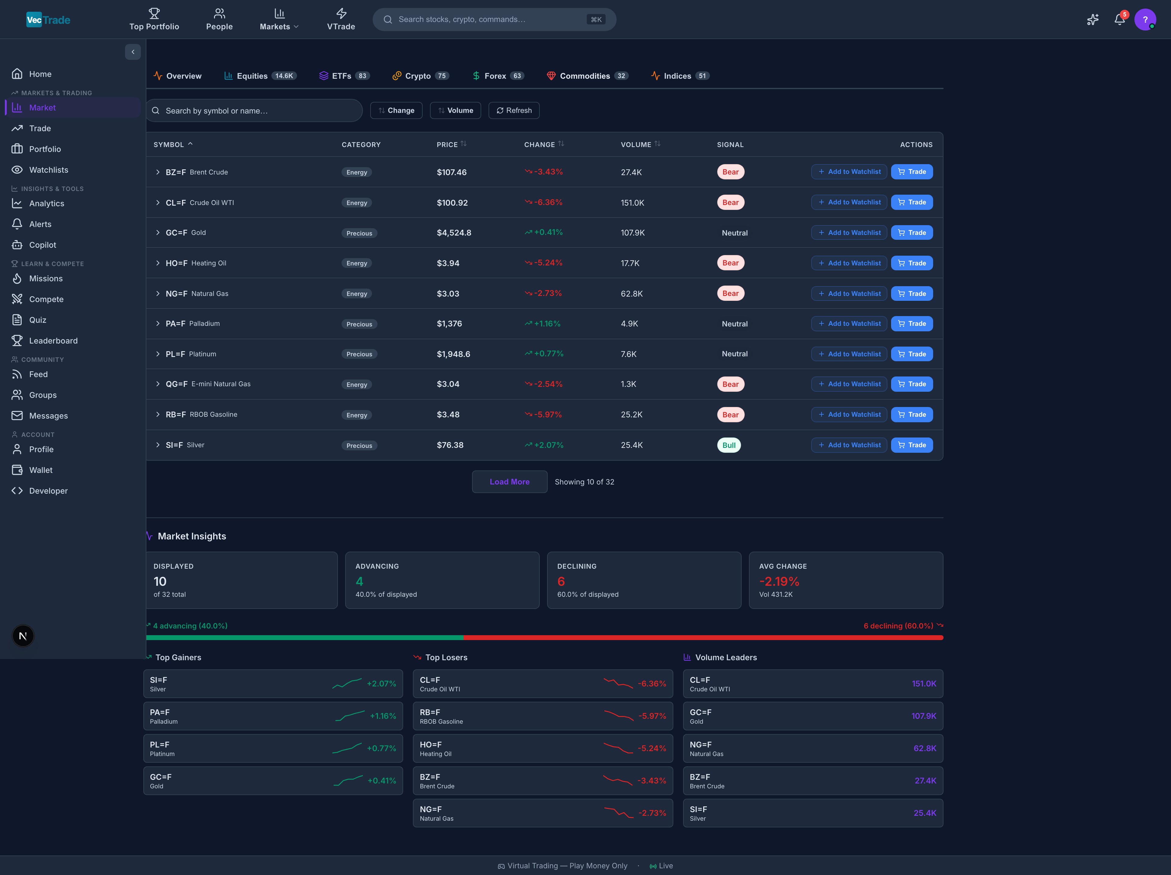
Table Columns: Symbol, Name, Category, Price, Change %, Volume, Open Interest, Contract Expiry.
Indices
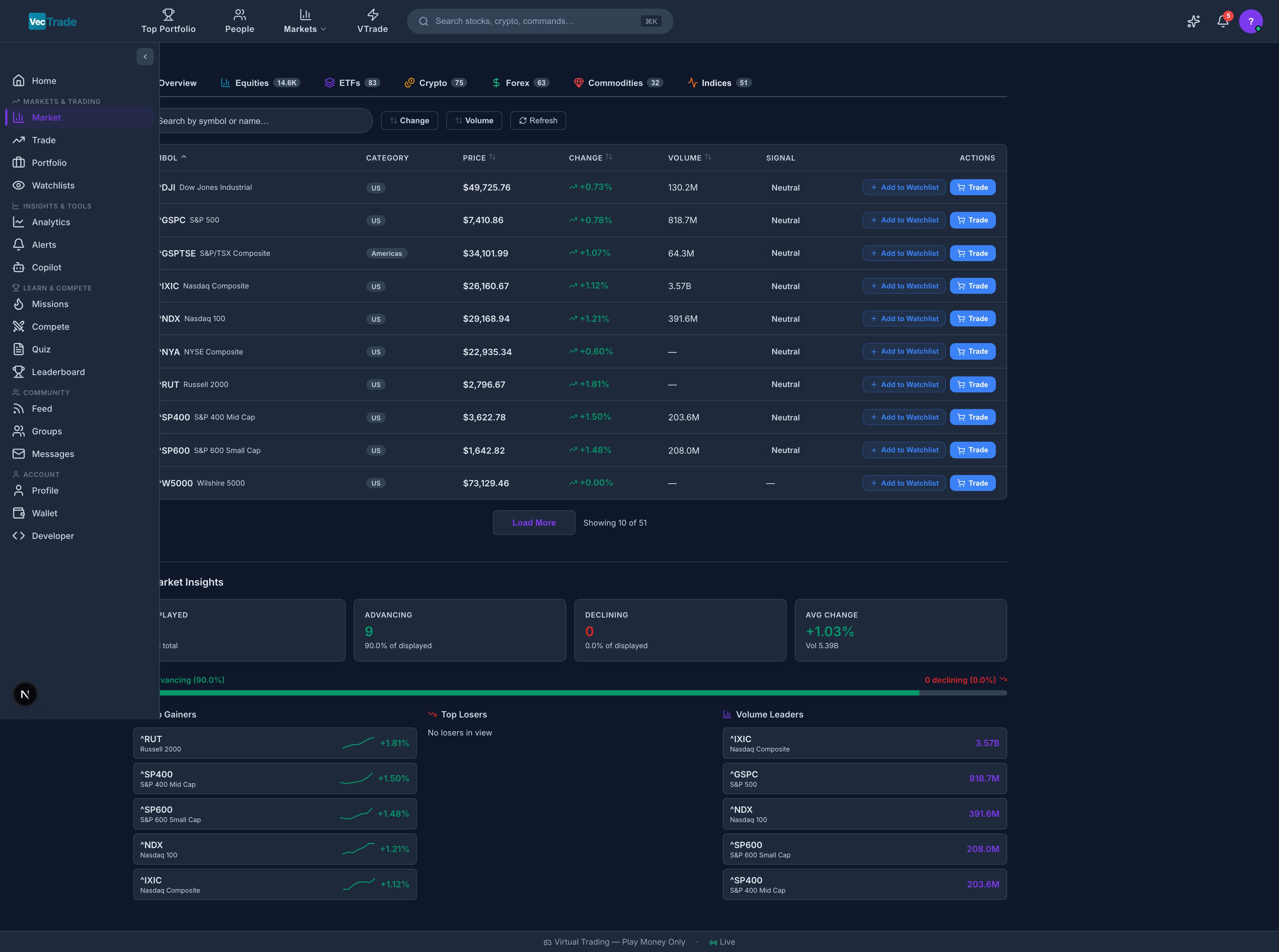
Table Columns: Index, Region, Level, Change %, Change (pts), YTD %, Session Status (Open/Closed).
Stock Detail Pages
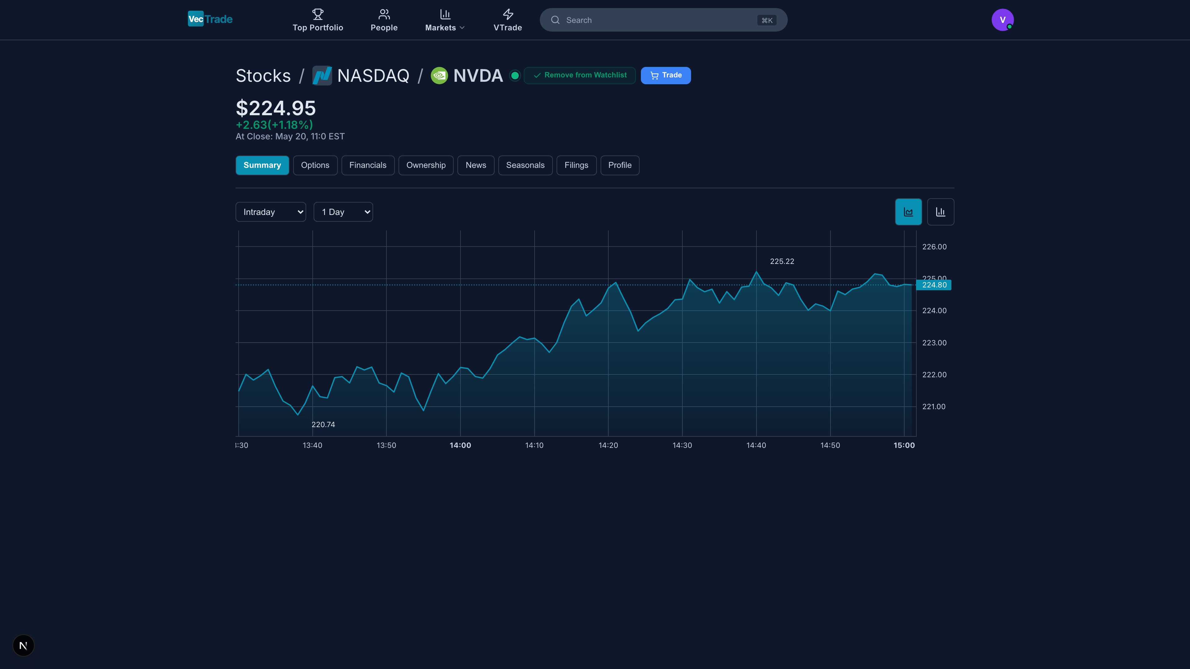
Clicking any instrument from the Market table, a watchlist, or a search result opens its comprehensive detail page. Stock pages feature 8 dedicated research tabs providing in-depth analysis.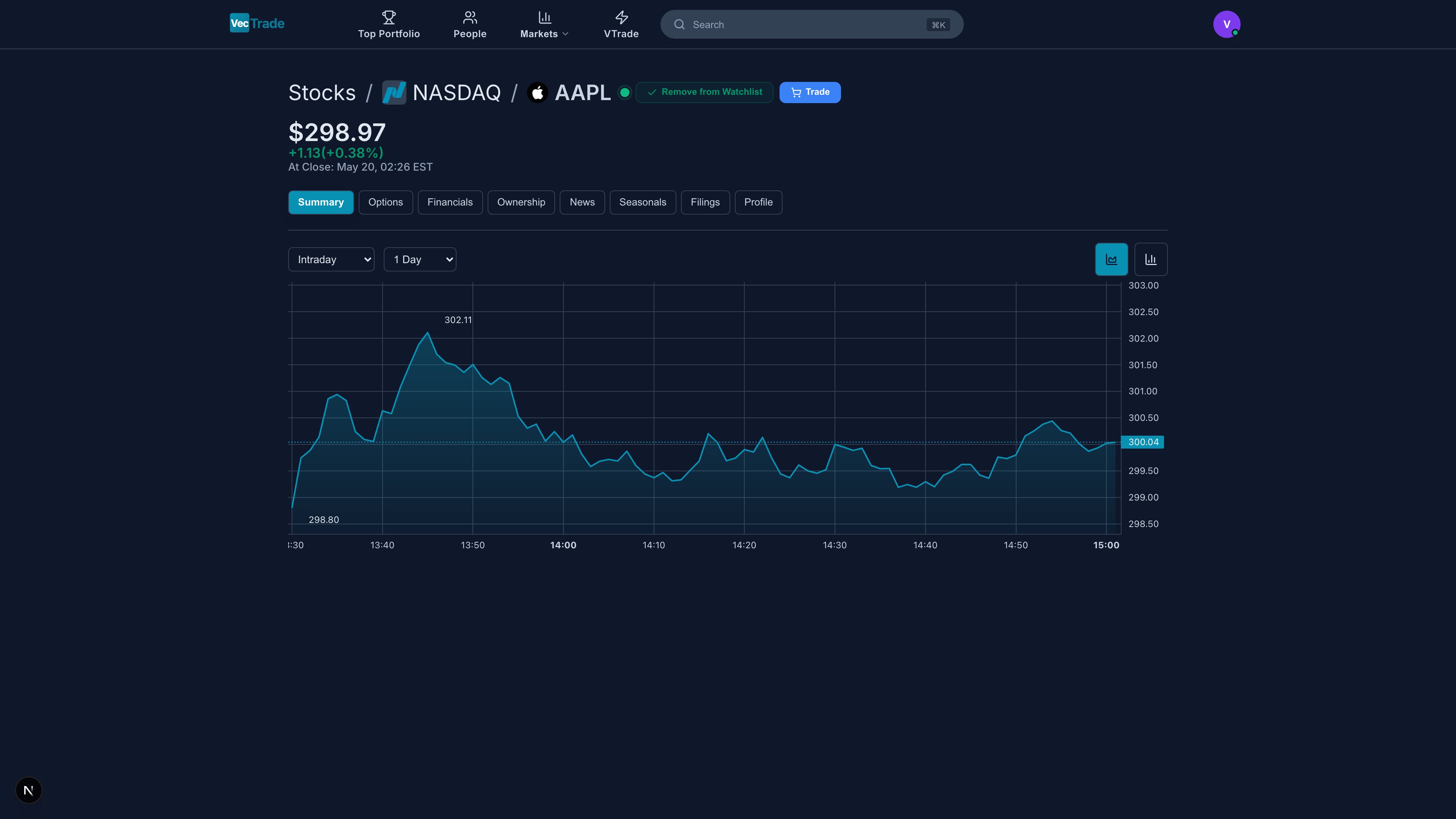
Accessing Stock Pages by Exchange
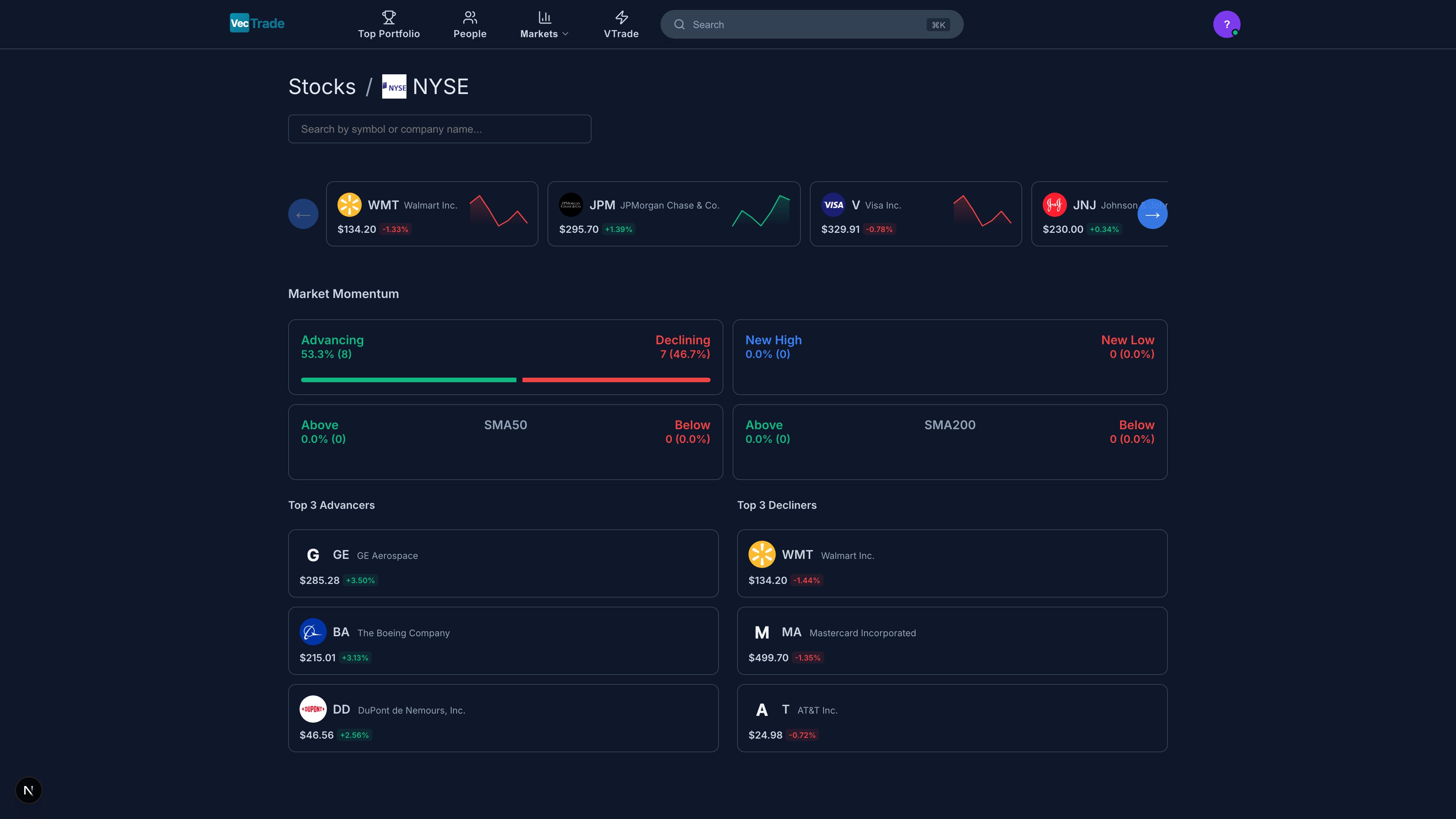
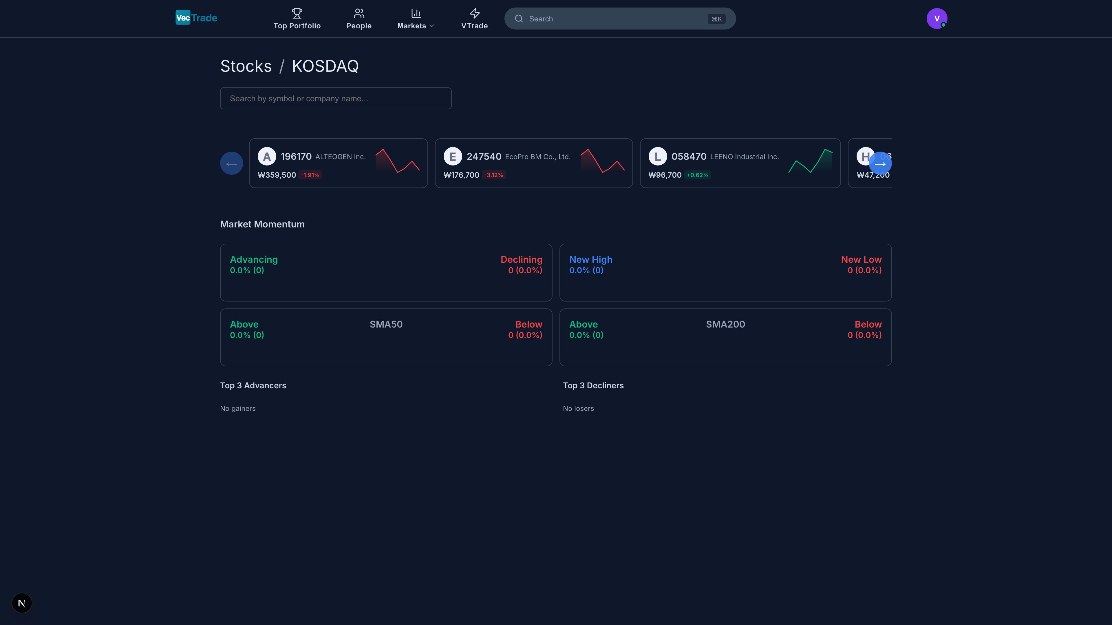
You can also browse stocks organized by their listing exchange. Each exchange page presents a comprehensive table sortable by price, change %, volume, market cap, P/E ratio, and sector. Click any row to navigate directly to the full stock detail page. NASDAQ — US Technology & Growth Equities: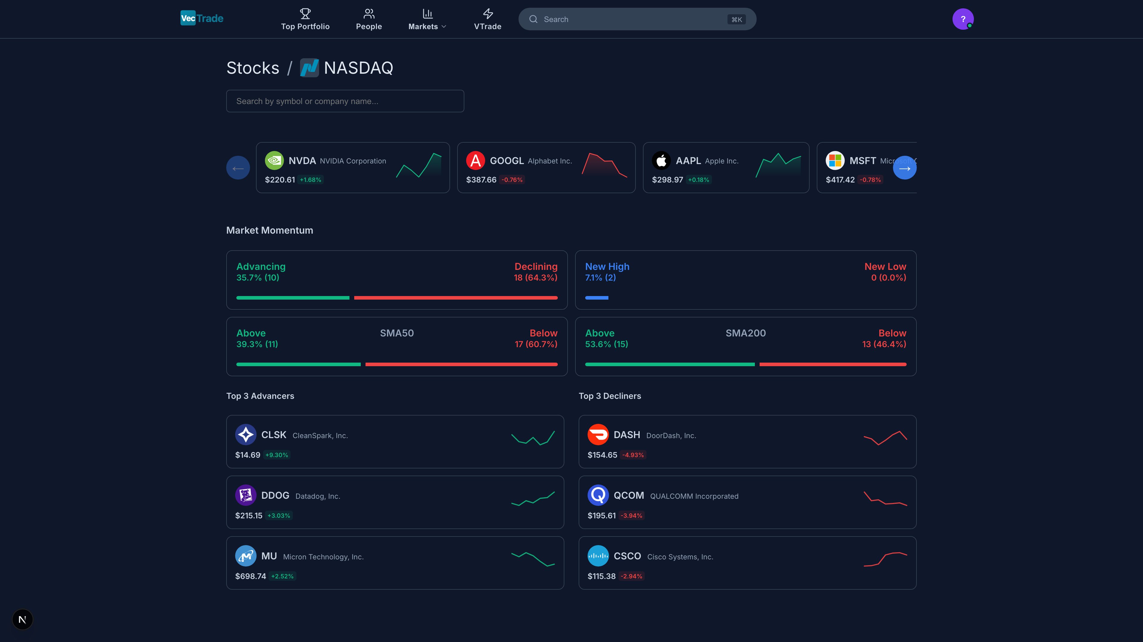
Tab 1: Summary
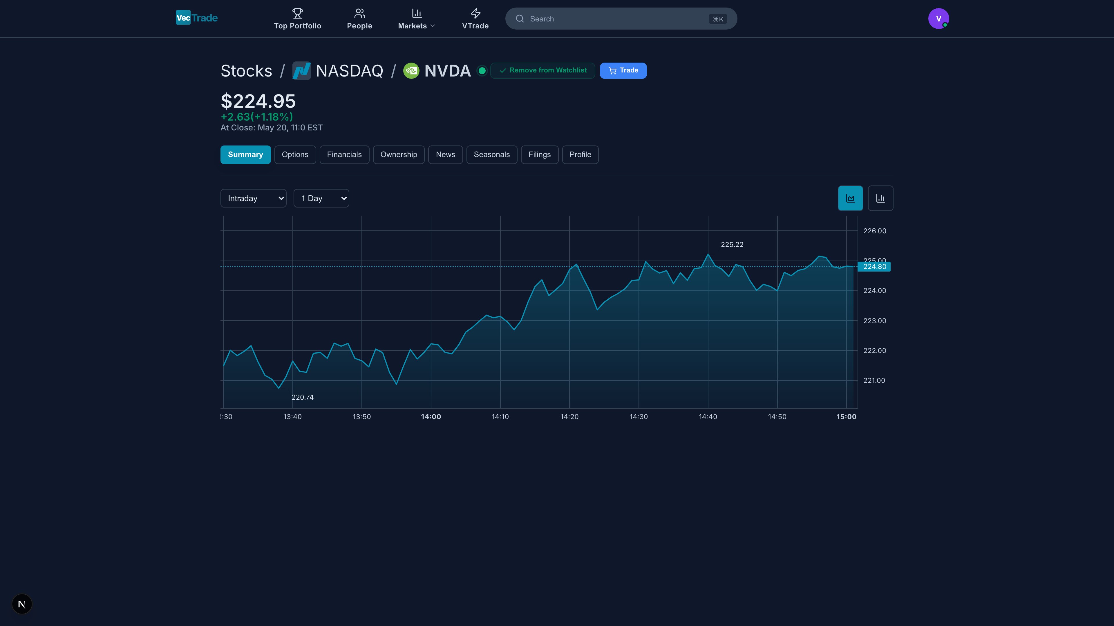
- Candlestick chart with configurable timeframes (1min – 1W)
- Technical indicator overlays (SMA, EMA, Bollinger Bands, RSI, MACD, VWAP)
- Volume histogram
- Drawing tools (trend lines, Fibonacci, horizontals)
- Full-screen mode for detailed analysis
Fundamental Snapshot:
AI Composite Score:
- VecTrade proprietary rating (0–100) combining technical, fundamental, and sentiment signals
- Broken down into component sub-scores with letter grades (A+ through F)
Tab 2: Options
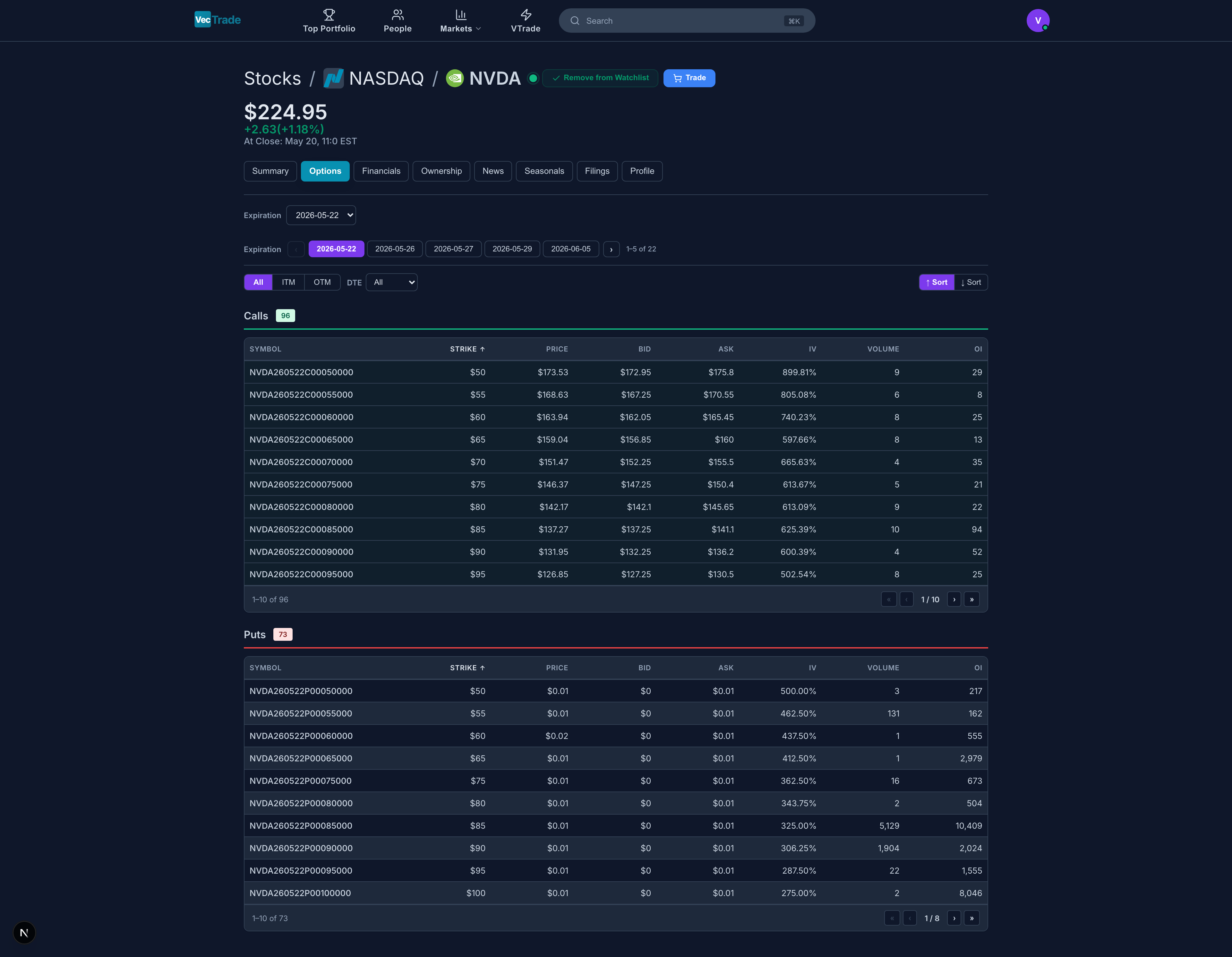
- Dropdown listing all available expiration dates (weeklies and monthlies)
- Days-to-expiration (DTE) shown next to each date
- Filter: All, Weeklies Only, Monthlies Only
Visual Indicators:
- In-the-money (ITM) contracts highlighted with a shaded background
- At-the-money (ATM) strike row emphasized with a border
- Volume heatmap — darker cells indicate higher relative volume
Tab 3: Financials
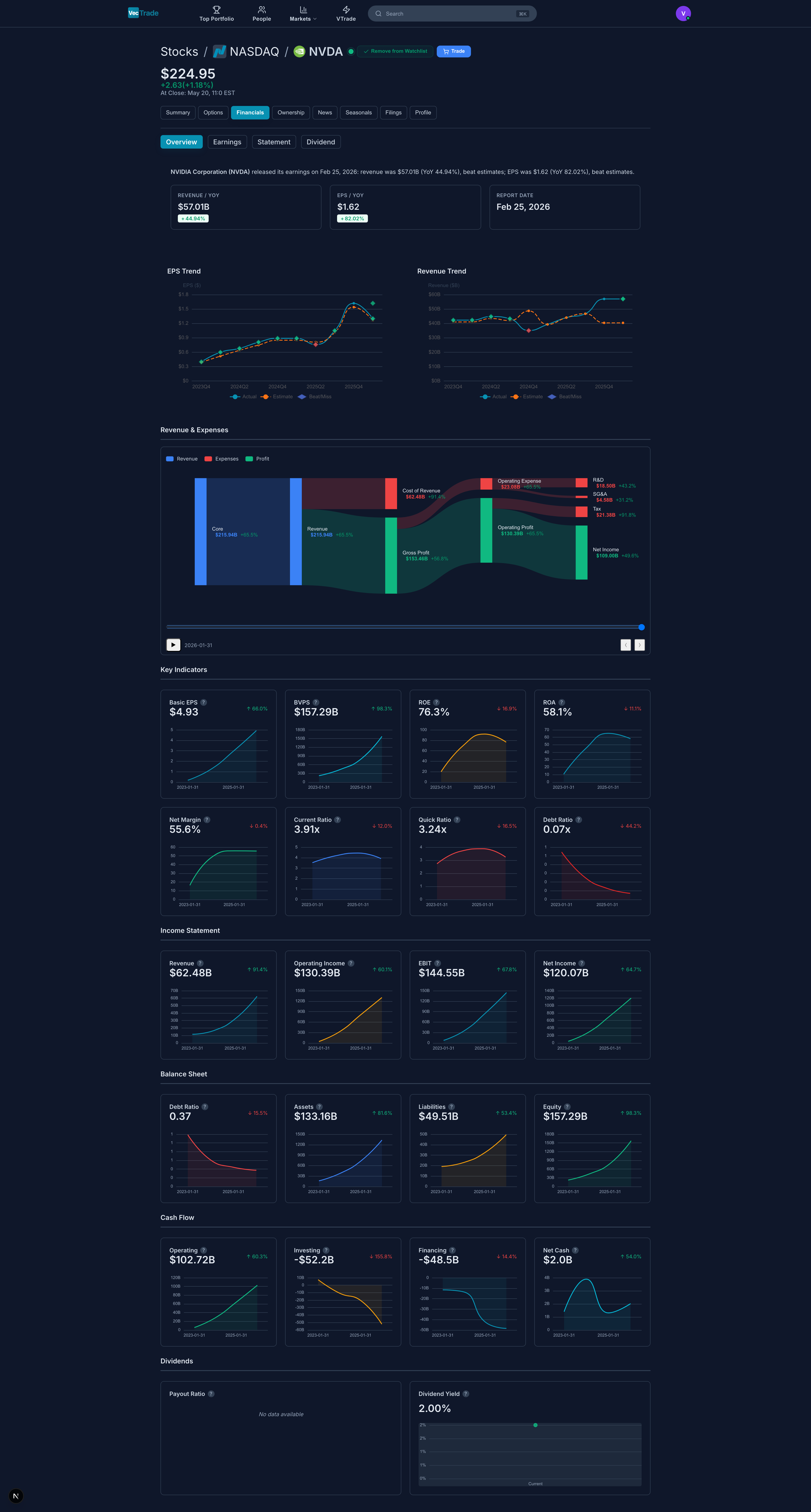
- Revenue, COGS, Gross Profit, Operating Expenses, EBITDA, Operating Income, Net Income
- Toggle between Quarterly and Annual views
- Multi-year comparison (up to 10 years of annual data, 20 quarters)
- Year-over-year growth rates highlighted
- Total Assets, Current Assets, Non-Current Assets
- Total Liabilities, Current Liabilities, Long-Term Debt
- Shareholder Equity, Retained Earnings, Book Value per Share
- Key ratios: Current Ratio, Debt-to-Equity, Quick Ratio
- Operating Cash Flow, Capital Expenditures, Free Cash Flow
- Investing Activities, Financing Activities
- Dividends Paid, Share Buybacks
- Net Cash Change
- Revenue Sankey Diagram — Flow chart showing revenue sources and how they convert to profit
- EPS History Chart — Quarterly EPS with analyst estimate bars (beats shown green, misses shown red)
- Dividend History — Payment timeline with yield calculation and growth rate CAGR
- Margin Trends — Line chart tracking gross, operating, and net margins over time
Tab 4: Ownership
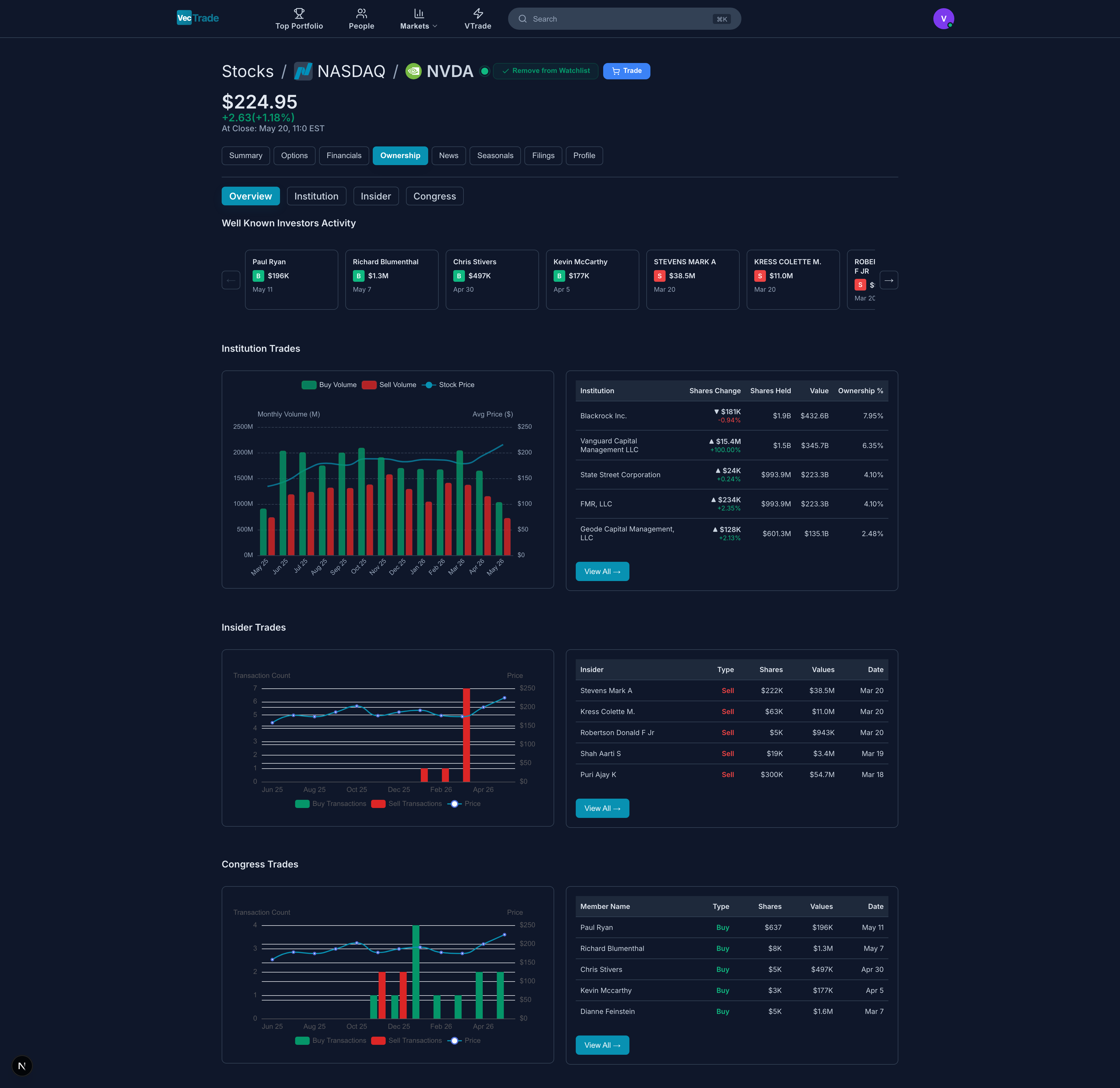
- Institutional investors (percentage and dollar value)
- Retail investors (individual shareholders)
- Insiders (executives, directors, 10%+ holders)
Insider Transactions (Table):
Congressional Trading (if applicable):
- Recent stock transactions by members of the US Congress
- Legislator name, party, chamber, transaction type, estimated value range, and disclosure date
Tab 5: News
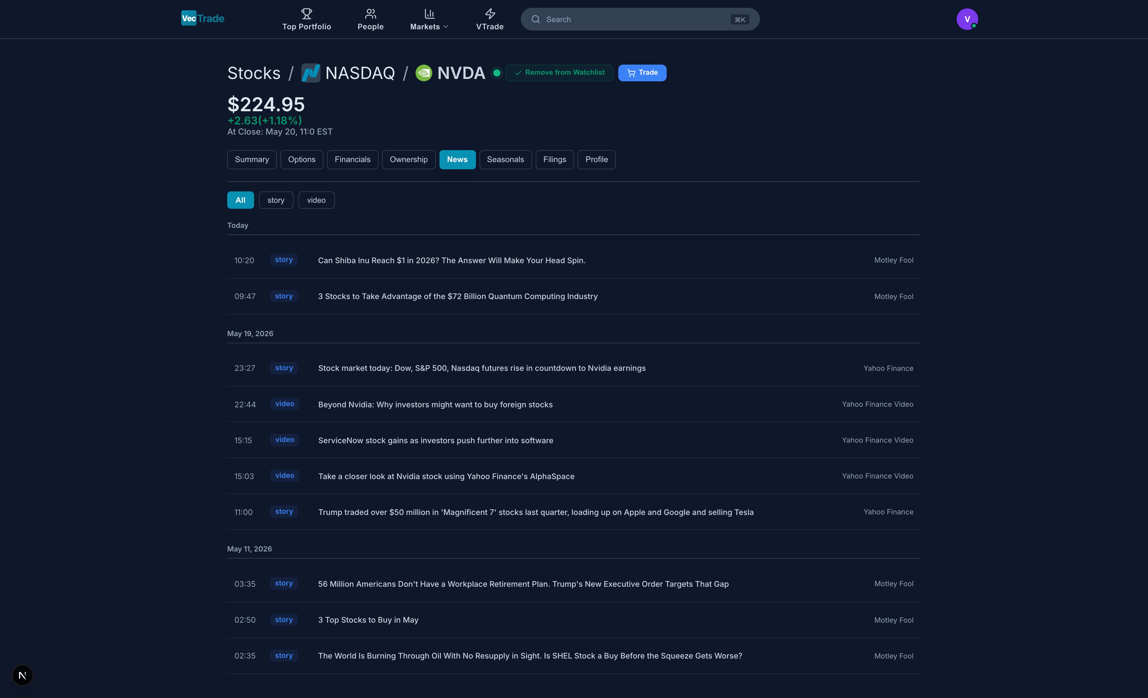
- Headline — Clickable link to full article
- Source — Publication name (Reuters, Bloomberg, CNBC, etc.)
- Timestamp — Publication date/time with relative indicator (“2 hours ago”)
- Sentiment Badge — AI-classified sentiment:
- 🟢 Bullish — Positive implications for the stock
- 🔴 Bearish — Negative implications for the stock
- ⚪ Neutral — Informational, no clear directional bias
- Summary — Two-line excerpt of the key information
Tab 6: Seasonals
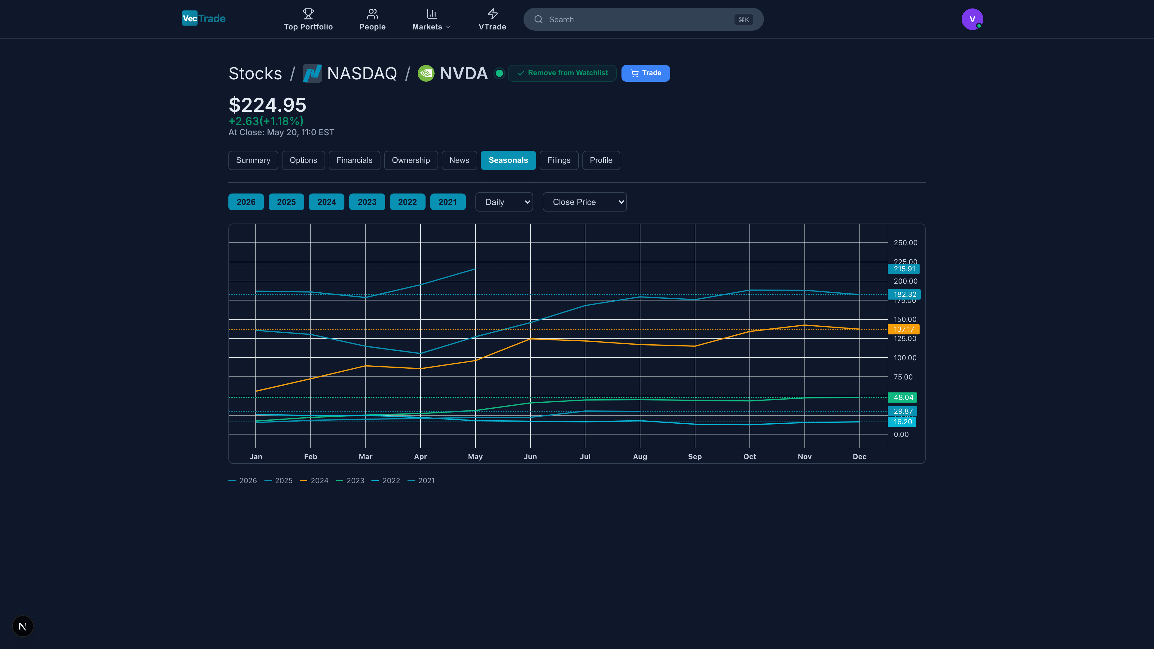
- 12 bars representing average return for each calendar month (based on 10-year history)
- Green bars = historically positive months; Red bars = historically negative months
- Standard deviation whiskers showing return dispersion
- Win rate label on each bar (e.g., “Jan: +2.3% avg, 70% positive”)
- “Best months” and “worst months” highlighted with confidence levels
- Notable recurring events (product launches, earnings cycles, dividend dates) annotated
- Year-over-year overlay comparison (this year vs. historical average)
Tab 7: Filings

Each filing entry shows: type badge, document title, filing date, and a direct link to the full document on SEC EDGAR.
Tab 8: Profile
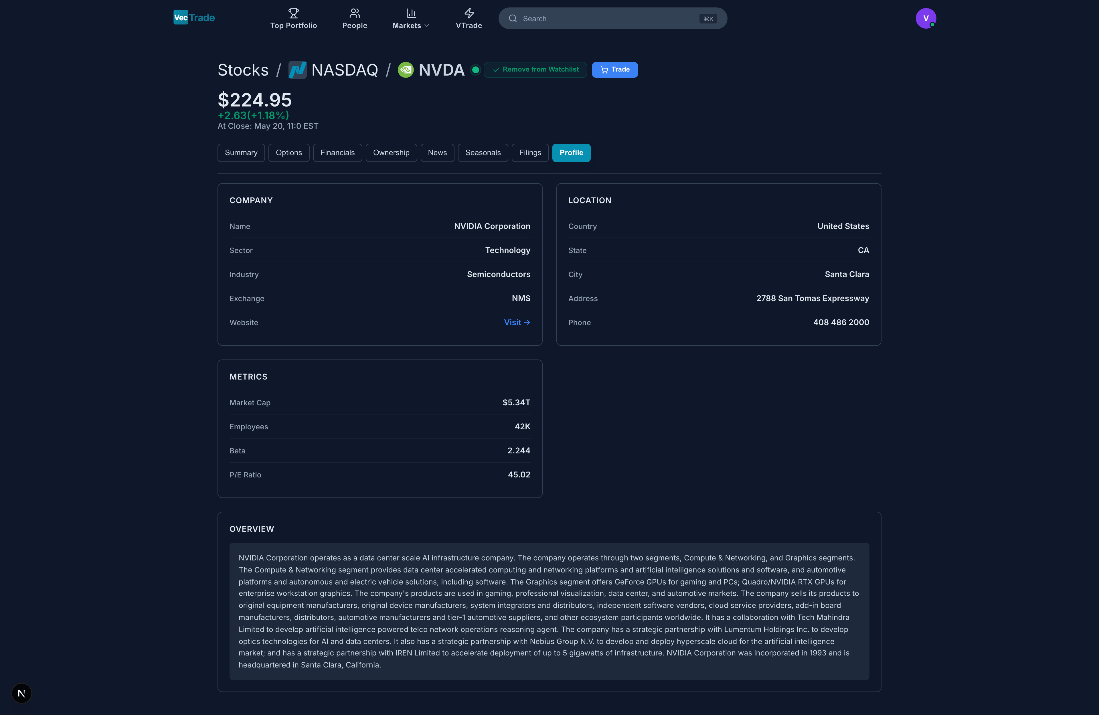
Key Executives Table:
- Name, Title, Age, Tenure, Total Compensation (annual)
Analytics Suite
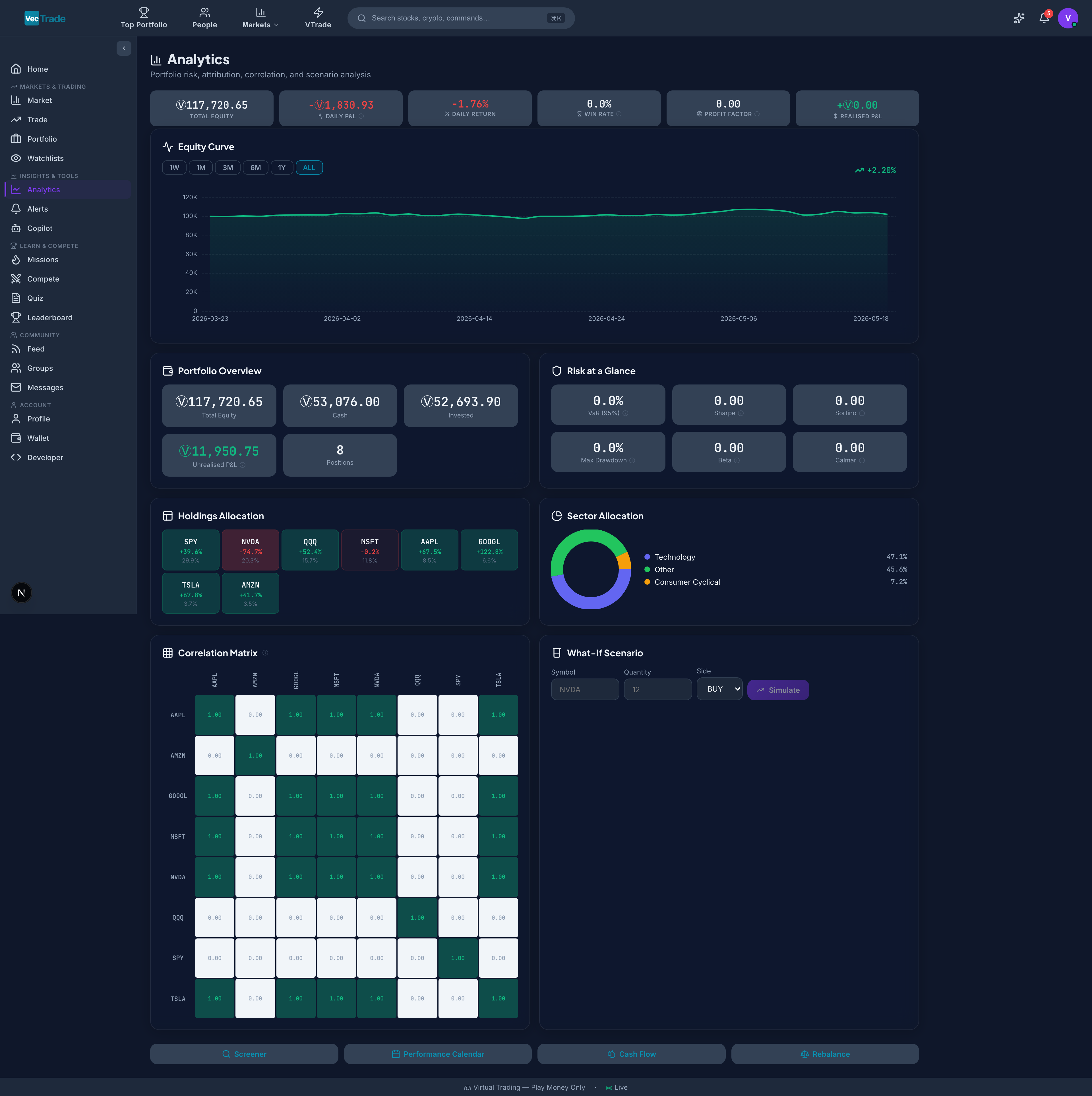
Analytics Dashboard
The main analytics view provides a multi-panel dashboard: Performance Strip:- Total equity, daily P&L, win rate, profit factor, Sharpe ratio — all visible without scrolling
- Portfolio value over time with benchmark comparison overlay
- Timeframe selector: 1W, 1M, 3M, 6M, 1Y, All-Time
- Drawdown waterfall beneath the main curve
- High-water mark and recovery periods shaded
Holdings Treemap:
- Rectangular grid where each rectangle represents a position
- Rectangle size = position weight in portfolio
- Rectangle color = profitability (green = profit, red = loss, intensity = magnitude)
- Hover for: symbol, weight %, P&L $, P&L %
- Interactive donut chart with sector breakdown
- Click a segment to filter the treemap to only that sector
- Heatmap grid showing pairwise correlations between all holdings
- Scale: -1.0 (perfectly inverse) to +1.0 (perfectly correlated)
- Helps identify diversification gaps (highly correlated positions)
- Select a hypothetical new position (symbol, quantity, direction)
- Preview how it would change: portfolio beta, Sharpe ratio, sector allocation, correlation profile
- Useful for pre-trade risk assessment before committing capital
Stock Screener
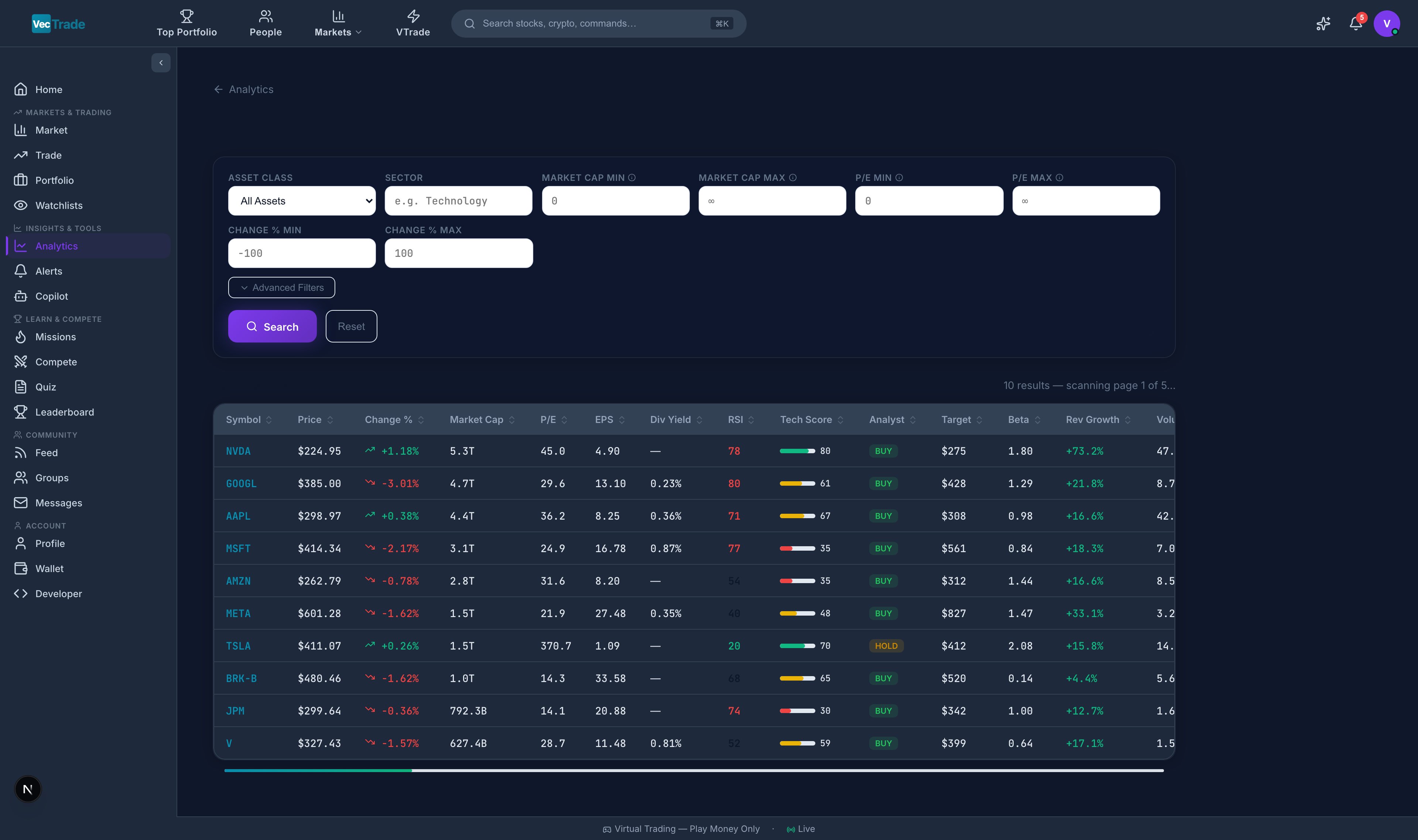
Results Table:
Matching instruments display in a comprehensive sortable table with all filter fields as columns, plus: current price, AI score, and action buttons (Trade, Add to Watchlist, View Detail).
Saved Screens:
Save frequently used filter combinations for one-click access. Examples: “Value Stocks,” “High-Growth Tech,” “Oversold Dividend Payers.”
Performance Calendar
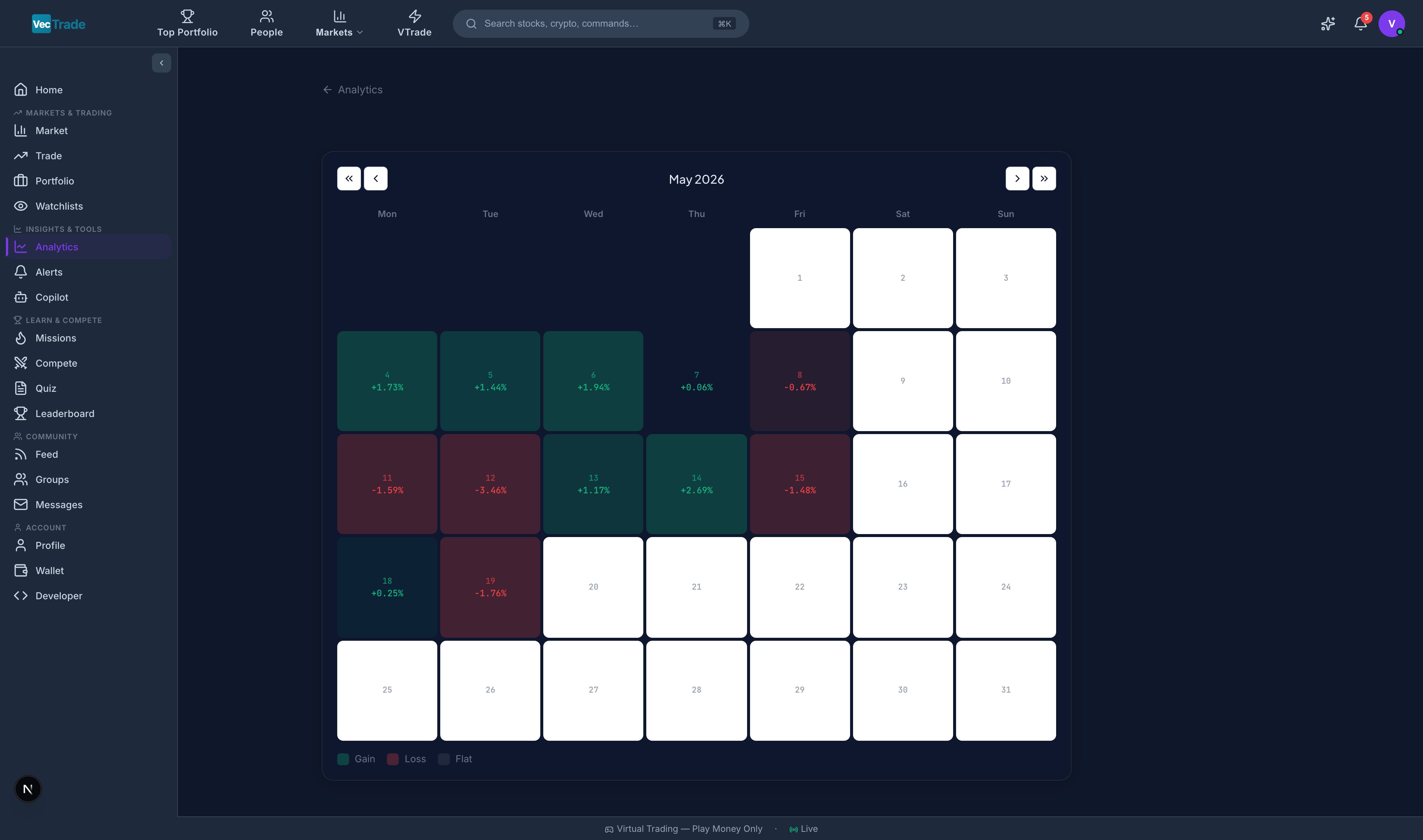
- Dark Green — Highly profitable day (> +2% portfolio return)
- Light Green — Moderately profitable (+0.5% to +2%)
- Grey — Minimal change or no activity
- Light Red — Moderate loss (–0.5% to –2%)
- Dark Red — Significant loss (< –2%)
- Hover any day for a tooltip showing: date, P&L ($), P&L (%), number of trades, best trade, worst trade
- Click any day to drill down into the full trade list for that session
- Navigate between months using arrow controls
- Toggle between: This Month, Last Month, Custom Month
- Best day ( and %), Average daily P&L
- Days profitable vs. days unprofitable (ratio)
- Longest winning streak, Longest losing streak
Cash Flow Analysis
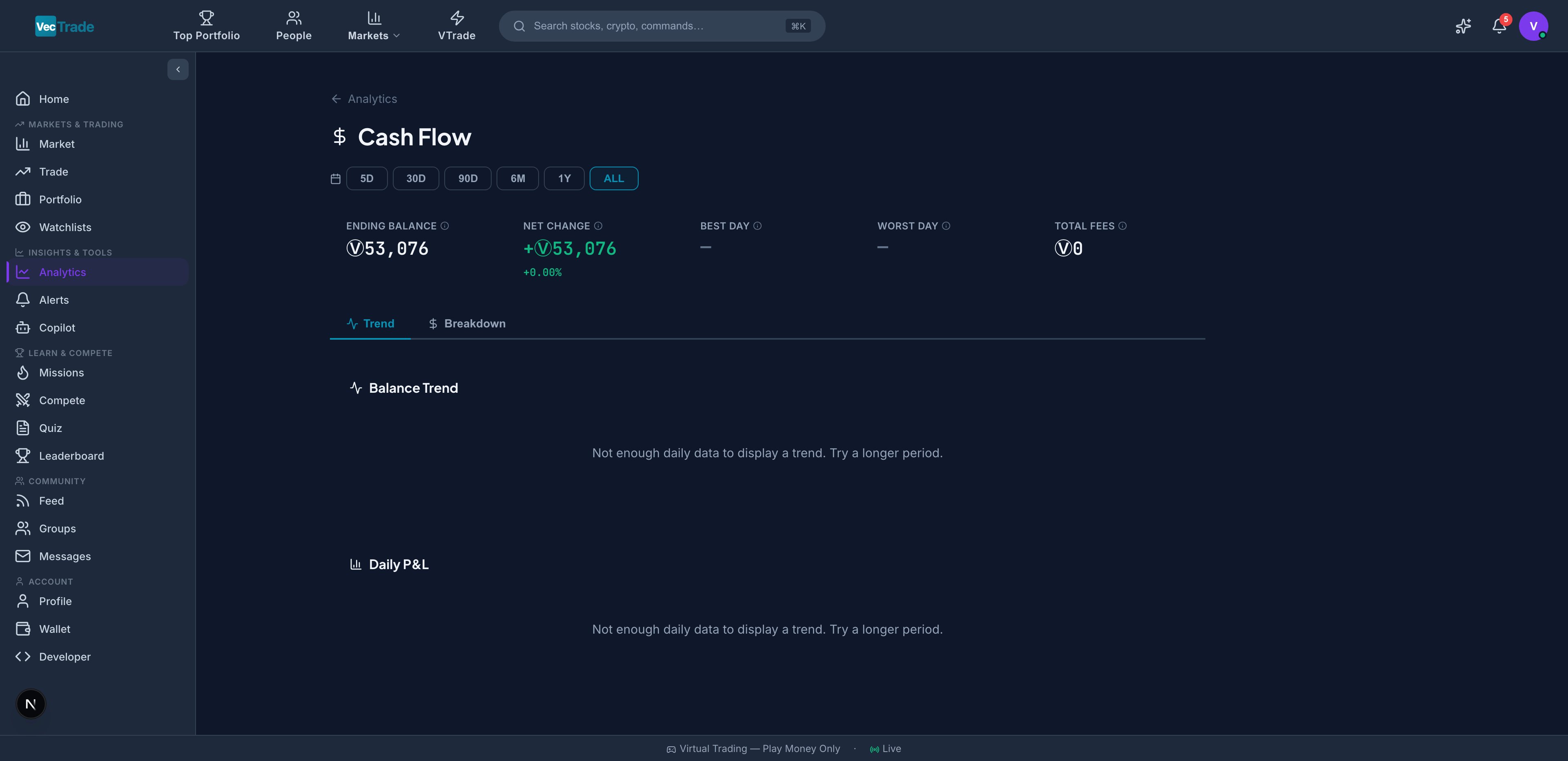
- Starting balance (leftmost bar)
-
- Trading profits (green bars)
- − Trading losses (red bars)
- − Fees paid (grey bars)
-
- Rewards earned (blue bars)
- = Ending balance (rightmost bar)
- Time-series showing net daily cash inflow/outflow
- Identifies patterns (e.g., consistent fee drain, reward spikes on competition days)
- Moving average overlay to smooth noise
- Net trading cash flow (all-time)
- Average daily cash flow
- Largest single-day inflow and outflow
- Total fees as % of total trading volume
Portfolio Rebalance Tool
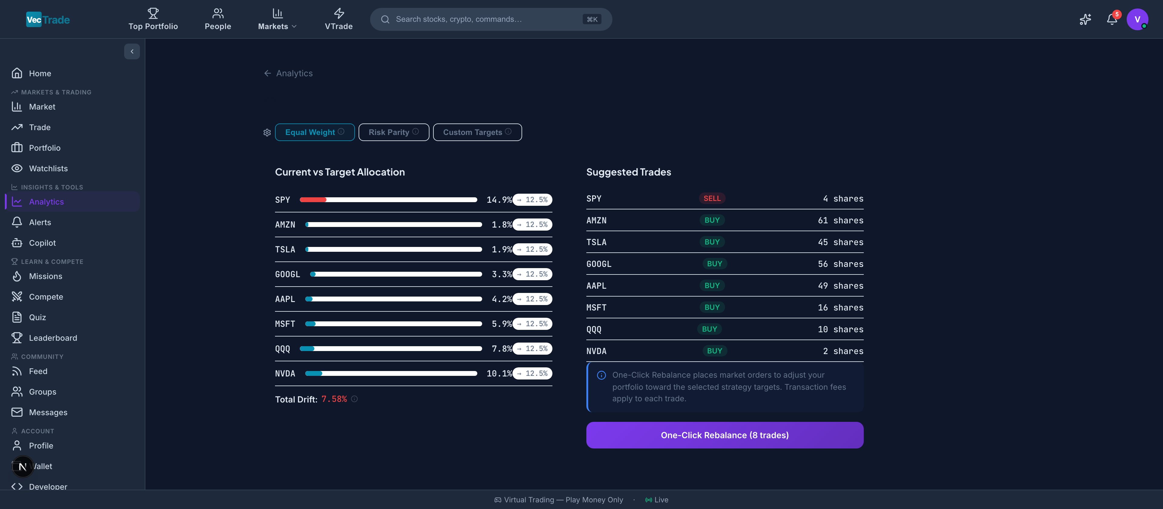
- Technology: 35%
- Healthcare: 20%
- Financials: 15%
- Energy: 10%
- Cash: 20%
Step 3 — Review Trade Suggestions:
The tool calculates specific trades required to restore target allocation:
- “Sell 5 shares of NVDA ($4,250 proceeds)”
- “Buy 10 shares of JNJ ($1,580 cost)”
- “Buy 15 shares of XLV ($2,100 cost)”
- Execute trades individually (click to open Trading Desk with order pre-filled)
- Execute all at once (batch execution with single confirmation)