

Portfolio Management
The Portfolio section provides a complete view of your trading activity, capital allocation, and historical performance. It functions as your personal investment command center — consolidating real-time valuations, attribution analysis, transaction records, and monitoring tools into a unified interface.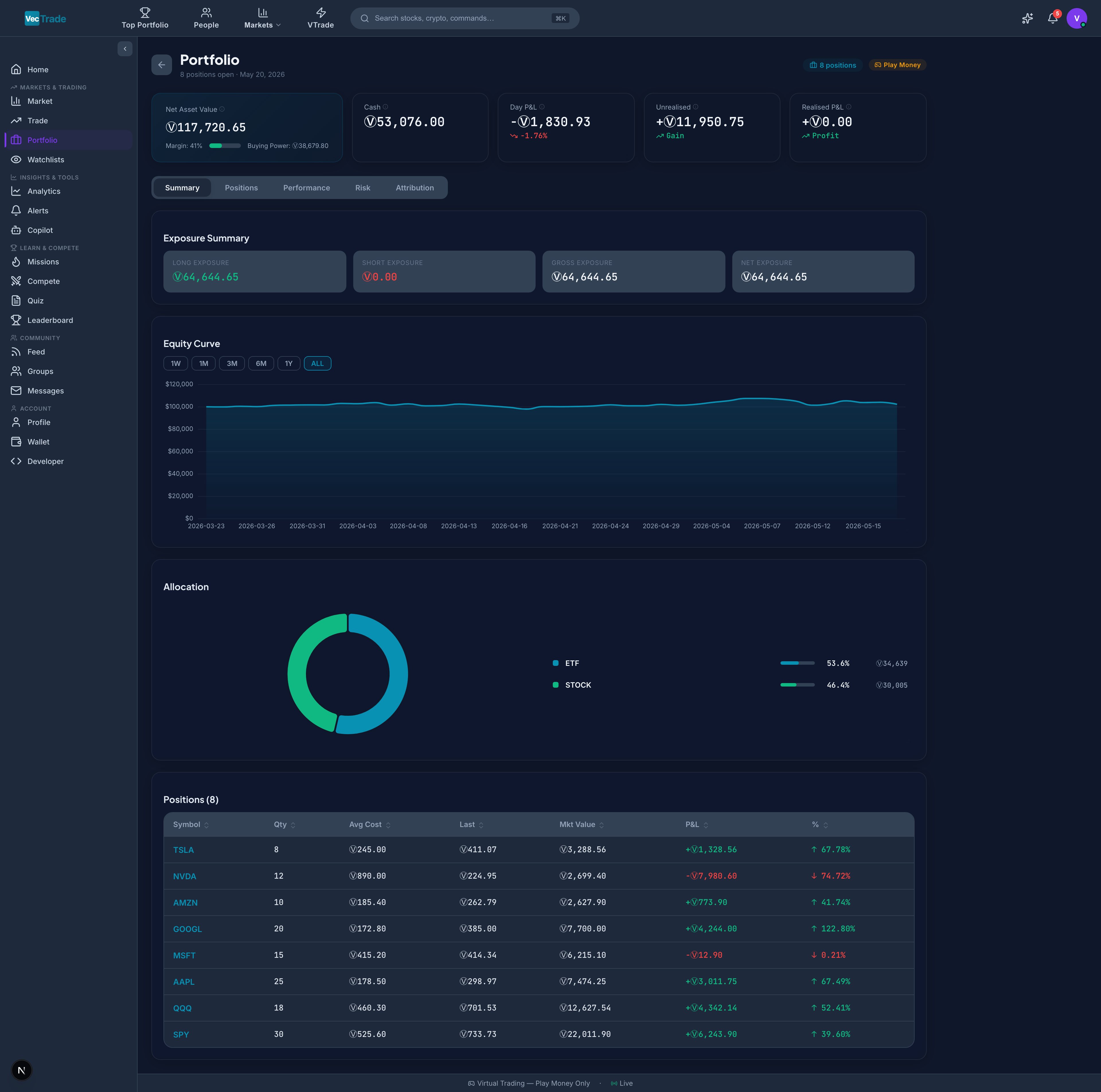
Portfolio Overview
Navigate to VTrade → Portfolio from the left sidebar to access your portfolio dashboard.Account Summary Metrics
The top section displays key account-level metrics in real-time:
A color-coded margin utilization bar provides immediate visual feedback:
- Green (0–50%) — Conservative allocation, ample buying power remaining
- Amber (50–80%) — Moderate concentration, reduced flexibility
- Red (80–100%) — High concentration, approaching position limits
Positions Table
Below the summary, the positions table displays every open holding with granular detail:
Row Interaction:
- Click the expand arrow (▶) on any position to reveal:
- Complete entry history (individual fills with timestamps and prices)
- Partial close history (any lots already sold)
- Realized P&L from partially closed lots
- Position-level analytics (beta contribution, sector classification, correlation to benchmark)
- Click the symbol to navigate directly to the Trading Desk for that instrument
- Click the close (×) icon to initiate a position close order
Allocation Visualization
Below the positions table, two complementary charts display portfolio composition: Sector Allocation (Donut Chart):- Each segment represents a GICS sector (Technology, Healthcare, Financials, etc.)
- Segment size proportional to combined position weight
- Hover to see exact percentage and dollar value
- Identifies concentration risk at a glance
- Horizontal bar split by asset class: Equities, ETFs, Crypto, Forex, Commodities
- Shows relative capital allocation across asset types
Performance Analytics
Switch to the Performance tab within Portfolio for comprehensive return analysis.Key Performance Indicators
Monthly Performance Heatmap
A calendar grid displaying monthly returns with color-intensity encoding:- Dark green — Strongly positive month (> +5%)
- Light green — Moderately positive month (+1% to +5%)
- Grey — Approximately flat (–1% to +1%)
- Light red — Moderately negative month (–1% to –5%)
- Dark red — Strongly negative month (< –5%)
Attribution Analysis
Understand where your returns are coming from across multiple dimensions: By Asset Class:- Equities contribution, ETFs contribution, Crypto contribution, Forex contribution, Commodities contribution
- Shows which asset classes are driving returns vs. dragging performance
- Technology, Healthcare, Financials, Energy, Consumer Discretionary, Industrials, etc.
- Identifies sector timing skill (or lack thereof)
- Long position returns vs. Short position returns
- Reveals directional bias and effectiveness
- Morning trades (first 2 hours) vs. Midday vs. Close (last hour)
- Identifies optimal trading windows for your strategy
Trade History
Navigate to Portfolio → History for a complete audit trail of every order submitted and executed. This view records every buy, sell, cancellation, and rejection with full execution details.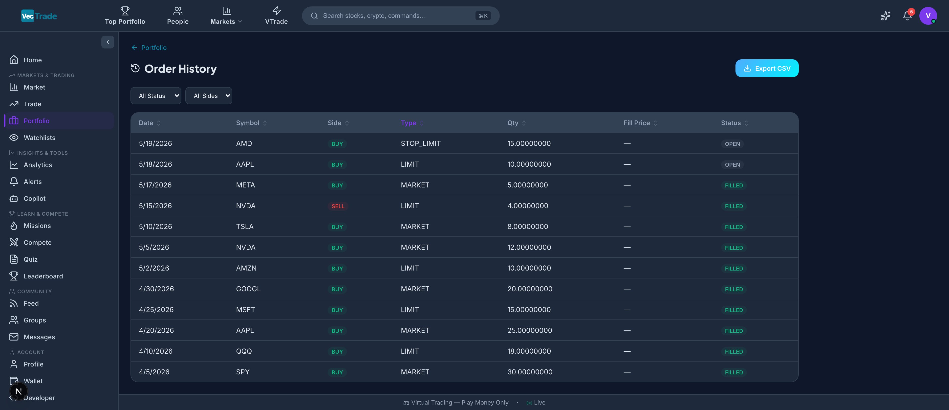
Transaction Record Table
Each trade entry contains:Advanced Filtering
The filter toolbar supports multi-dimensional queries:Export Capabilities
Click Export CSV to download your filtered trade history as a comma-separated file compatible with:- Microsoft Excel / Google Sheets
- TradingView import
- Third-party portfolio trackers
- Tax preparation software
- Custom analysis scripts
Portfolio Snapshots
Navigate to Portfolio → Snapshots for time-series visualization of your portfolio evolution. The equity curve is the most important single chart in portfolio management — it tells the story of your cumulative trading performance over time.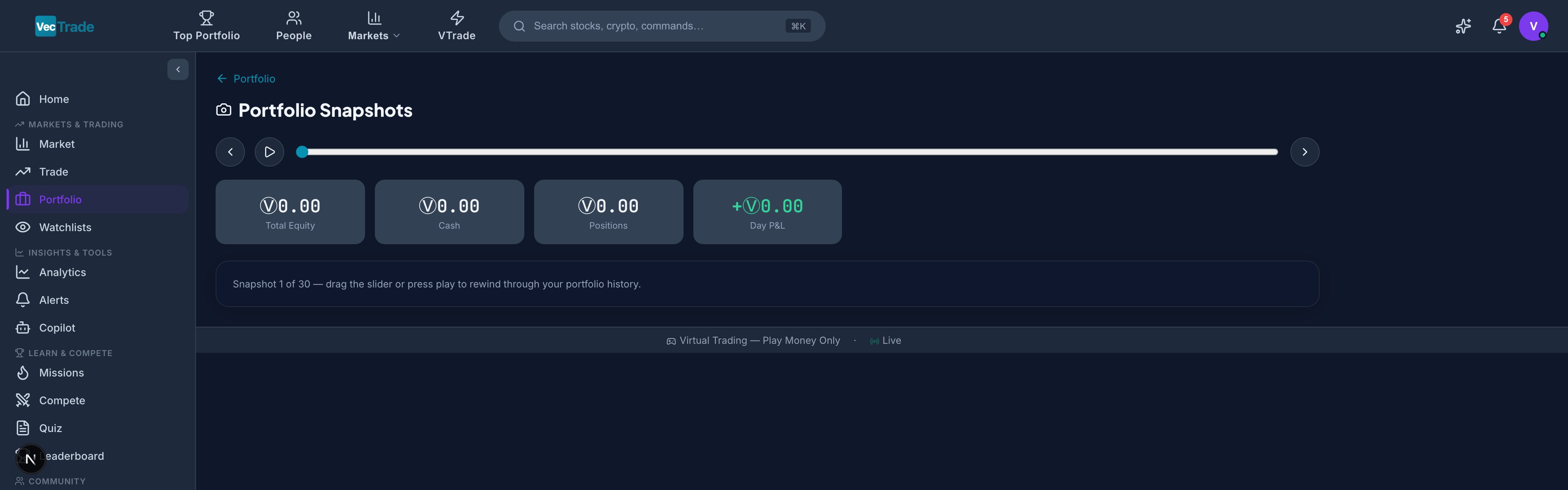
Equity Curve
VTrade captures an end-of-day snapshot of your total portfolio value every trading day. These snapshots form your equity curve — the most important visual representation of your trading performance over time. Timeframe Selector:- 1 Week (5 trading days)
- 1 Month (21 trading days)
- 3 Months (63 trading days)
- 6 Months (126 trading days)
- 1 Year (252 trading days)
- All Time (since account creation)
- Line chart with area fill showing cumulative portfolio value
- Benchmark overlay (S&P 500 total return) for relative performance comparison
- Drawdown shading — periods where portfolio was below its previous all-time high are highlighted in translucent red
- High-water mark line — horizontal line at the portfolio’s peak value
Period-Specific Risk Metrics
For each selected timeframe, a metrics panel displays:Wallet
The Wallet tracks your VCR (VecTrade Virtual Currency) balance and provides a complete financial ledger of all credits and debits — including trading activity, commission fees, and rewards earned from competitions, missions, and referrals.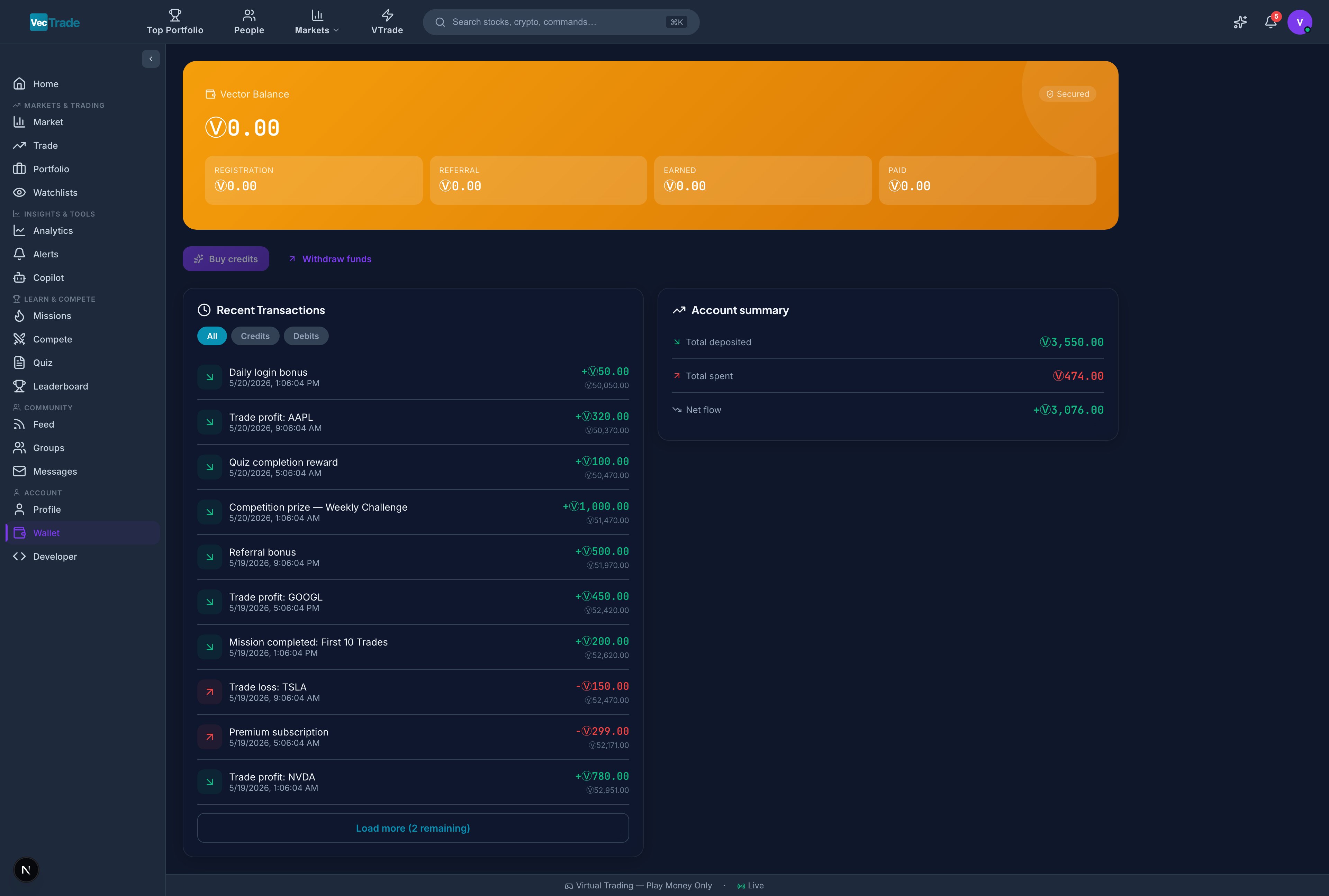
Balance Display
A prominent card shows your current VCR balance with:- Available Balance — Funds free to deploy in new positions
- Reserved (In Orders) — Funds allocated to pending/working orders
- Total Account Value — Available + Reserved + Position Market Values
Transaction Ledger
A chronological log of every wallet movement:
Each entry displays: timestamp, type, amount (+/–), running balance, and reference ID.
Filtering Options
Transactions load in paginated batches of 20. Click Load More to retrieve older entries.
Account Summary Panel
A consolidated financial overview:Watchlists
Watchlists allow you to organize and monitor instruments of interest without holding a position. They serve as your research pipeline — tracking candidates for potential trades, monitoring sector leaders, and receiving automated alerts when conditions are met.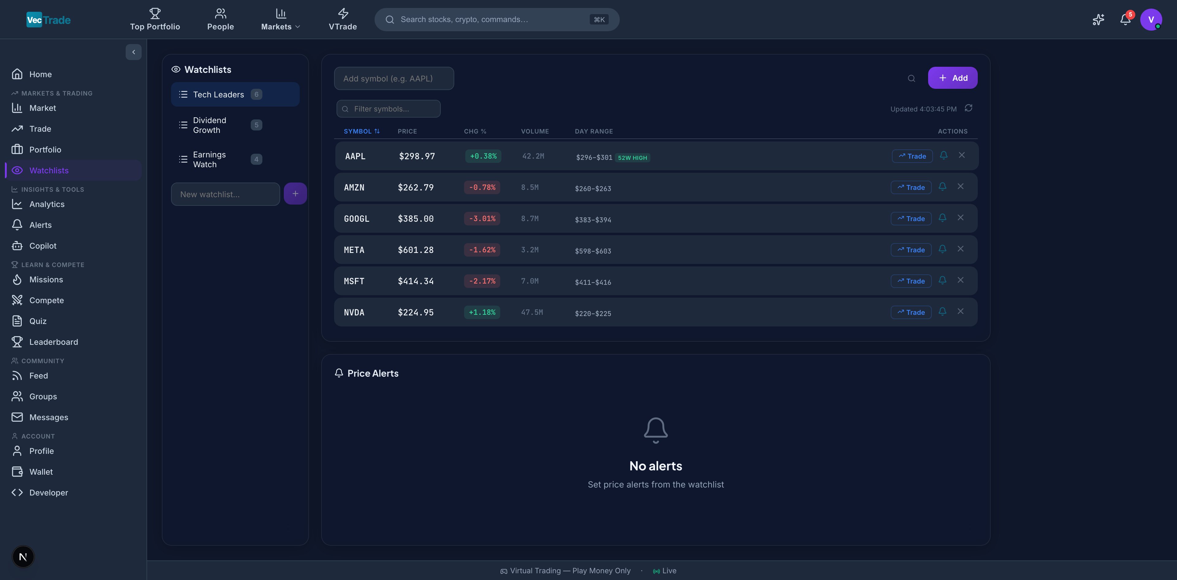
Creating and Managing Watchlists
To create a new watchlist:- Navigate to VTrade → Watchlists
- Click + New Watchlist in the left sidebar panel
- Enter a descriptive name (e.g., “AI Semiconductor Plays”, “Earnings This Week”, “Dividend Aristocrats”)
- The empty list is created — now add instruments
- Click + Add Symbol at the top of the watchlist
- Search by ticker or company name
- Click the result to add it to the active list
- Alternative: from any stock page or search result, click the watchlist icon (☆) and select the target list
- Click the × icon on any row to remove it from the list
- Or right-click → Remove from Watchlist
- Right-click the watchlist name in the sidebar → Rename or Delete
Watchlist Data Columns
Each instrument in a watchlist displays live data refreshing every 30 seconds:52-Week Proximity Badges
Automatic visual indicators appear when price approaches extremes:Quick Actions
Each watchlist row provides single-click actions:- Trade — Navigate directly to the Trading Desk with this symbol loaded
- Chart — Open a full-screen chart view
- Copilot — Ask AI for a quick analysis of this instrument
- Alert — Configure a price alert (detailed below)
Price Alert System
Click the bell icon (🔔) on any watchlist row to configure automated price notifications:
Alert Lifecycle:
- Active — Monitoring (shown with blue bell icon)
- Triggered — Condition met (shows “Triggered” badge with timestamp)
- Expired — If configured with an expiry date that has passed
- In-app notification (bell icon in the top navigation bar)
- Email notification (if enabled in Settings → Notifications)
- Push notification (if enabled in Settings → Notifications)